サイト内検索
Cocoonフォーラム
書き込みの前に以下の3点をご確認ください。
何を書き込んだら良いか分からない場合は、以下のテンプレートをコピペしてご利用ください。
不具合・カスタマイズ対象ページのURL:
相談内容:
不具合の発生手順:
解決のために試したこと:
※文字だけでは正しく伝わらない可能性があるため、スクショ画像の添付もお願いします。
※高速化設定をしている場合は無効にしてください。
環境情報:※↑こちらに「Cocoon設定 → テーマ情報」にある「環境情報」を貼り付けてください。
環境情報の取得方法はこちら。
→ https://wp-cocoon.com/theme-report/
高速化設定を無効にするにはこちら。
→ https://wp-cocoon.com/theme-trouble/
フォーラム利用ガイドリンク
- フォーラムガイドライン
- よくある質問と答え(FAQ)
- サポート対象外のケース
- 原因不明の不具合用トラブルシューティング
- トピックにHTMLを貼り付ける方法(推奨ツール:notepad.pw)
- 真っ白画面でのエラーメッセージの確認方法
- ブラウザ環境チェックツール
- Cocoonカスタマイズ依頼
フォーラム質問後、問題等が解決した場合は結果を書き込んでいただけると幸いです。同様の問題で調べている方には、結果が一番気になる部分となります。
このフォーラムには初心者の方も多く参加されています。質問に不慣れな方も安心して相談できるよう、できるだけ穏やかな言葉でご案内いただけますと幸いです。
通知
すべてクリア
トピックスターター 2020年4月16日 19:06
担当者様
お世話になっております。
最近cocoonを使用させていただき
いろいろカスタマイズしていたのですが
記事を投稿した際、スマホのトップ画面にでるタイトル表示が大きく出てしまい
修正が出来なくなってしまいました。
(PCでは問題ございません)
プログラミングは素人でネットで調べながら
カスタマイズをしていた為だと思われます。
【ブログURL】↓↓
添付ファイルがトップ画面のタイトルに画像が隠れている画像です。
カスタマイズしたcssも下記に記載させていただきます。
助けて頂けましたら幸いです。
熊内 孝之
-----------------------------------------
@charset "UTF-8";
/*!
Theme Name: Cocoon Child
Template: cocoon-master
Version: 1.1.0
*/
/************************************
** 子テーマ用のスタイルを書く
************************************/
/*必要ならばここにコードを書く*/
/************************************
** レスポンシブデザイン用のメディアクエリ
************************************/
/*1240px以下*/
@media screen and (max-width: 1240px){
/*必要ならばここにコードを書く*/
}
/*1023px以下*/
@media screen and (max-width: 1023px){
/*必要ならばここにコードを書く*/
}
/*834px以下*/
@media screen and (max-width: 834px){
/*必要ならばここにコードを書く*/
}
/*480px以下*/
@media screen and (max-width: 480px){
/*必要ならばここにコードを書く*/
}
.nwa .author-box {
text-align: center;
max-width: 100%;
}
.sidebar .author-box {
border: none;
border-radius: 4px;
margin: 1em 0;
line-height: 1.4;
position: relative;
padding: 1.4% 2% 1.8%;
}
.nwa .author-box .author-thumb {
float: none;
width: 100%;
margin: 9px auto 0;
background: url(  ) center no-repeat;
background-size: cover;
height: 0;
padding-top: calc(100%*392/700);
position: relative;
}
.sidebar .author-thumb img {
border: 3px solid #fff;
width: 30%;
margin: 0 auto;
position: absolute;
left: 0;
right: 0;
bottom: -25%;
}
.nwa .author-box .author-content {
margin-top: 16%;
font-size: 0.9em;
}
.author-name {
font-size: 1.1em;
font-weight: bold;
margin-bottom: 10px;
}
.author-box .author-name a {
text-decoration: none;
color: #333;
}
.author-box p {
margin-top: 0.3em;
line-height: 1.6;
}
.author-box p a {
text-decoration: none;
color: #008cee;
}
.author-box p a:hover {
text-decoration: underline;
color: #008cee;
}
.author-box .sns-follow-buttons a.follow-button {
font-size: 20px;
width: 40px;
height: 40px;
border-radius: 50%;
border: none;
margin-bottom: 4px;
margin-right: 8px;
background: none;
color: #fff;
}
.author-box a.follow-button span {
line-height: 40px;
}
.author-box a.follow-button span::before {
font-size: 22px;
}
.author-box .icon-twitter-logo::before {
font-family: FontAwesome;
content: "\f099"
}
.author-box .icon-facebook-logo::before {
font-family: FontAwesome;
content: "\f09a";
}
.author-box .icon-instagram-new::before {
font-family: FontAwesome;
content: "\f16d";
}
.author-box .icon-hatebu-logo::before {
font-family: Verdana;
content: 'B!';
font-weight: bold;
}
.author-box .icon-google-plus-logo::before {
font-family: FontAwesome;
content: "\f0d5";
}
.author-box .icon-youtube-logo::before {
font-family: FontAwesome;
content: "\f167";
}
.author-box .icon-pinterest-logo::before {
font-family: FontAwesome;
content: "\f231";
}
.author-box .icon-amazon-logo::before {
font-family: FontAwesome;
content: "\f270";
}
.author-box .icon-github-logo::before {
font-family: FontAwesome;
content: "\f09b";
}
.author-box .website-button { background-color: #47555c !important; }
.author-box .twitter-button { background-color: #1da1f2 !important; }
.author-box .facebook-button { background-color: #3b5998 !important; }
.author-box .instagram-button { background: #e1306c !important; }
.author-box .youtube-button { background-color: #ef1515 !important; }
#main .author-box {
border: none;
border-radius: 3px;
margin: 1em 0;
line-height: 1.4;
position: relative;
padding: 1.4% 2% 1.8% 0;
box-shadow: 0 5px 20px -5px rgba(105,115,131,.35);
}
#main .author-widget-name {
display: inline-block;
position: relative;
margin: 10px 0 0 -170px;
padding: 6px 12px;
border-radius: 20px;
background: #eaedf2;
color: #555;
font-size: 14px;
font-weight: 700;
z-index: 1;
}
#main .author-widget-name::before {
position: absolute;
content: '';
z-index: -1;
bottom: -30px;
left: 60px;
border: 15px solid transparent;
border-top: solid 30px #eaedf2;
transform: rotate(-40deg);
}
#main .author-thumb {
float: left;
margin: 0;
padding-top: 70px;
width: 200px;
text-align: center;
}
#main .author-thumb img {
border: solid 5px #dfe2e8;
width: 100px;
}
#main .author-content {
margin: -30px 0 0 200px;
padding-left: 30px;
border-left: 2px #eaedf2 dashed;
}
#main .author-box .author-name {
line-height: 1;
}
#main .author-box p {
font-size: .95em;
}
@media screen and (max-width: 480px){
#main .author-box {
margin: 1em 10px;
padding: 16px;
text-align: center;
}
#main .author-widget-name {
margin: 0;
}
#main .author-widget-name::before {
left: 50px;
}
#main .author-thumb {
float: none;
margin: 0;
padding-top: 20px;
width: 100%;
}
#main .author-box .author-name {
font-size: 14px;
}
#main .author-content {
margin: 10px 0 0 0;
padding-left: 0;
border: none;
}
#main .author-box p {
font-size: 14px;
text-align: left;
}
#main .author-box .sns-follow-buttons {
justify-content: center;
}
}
.profilepage-link {
text-align: center;
margin-bottom: 20px;
}
#main .profilepage-link {
text-align: left;
}
.profilepage-link a {
display: inline-block;
font-size: .9em;
text-decoration: none;
color: #fff; /*ボタンの文字色*/
background: #95a3fc; /*ボタンの背景色*/
padding: .5em 2em;
border-radius: 4px;
box-shadow: 0 4px 6px -1px rgba(0,0,0,.2);
transition: .3s ease-in-out;
}
.profilepage-link a:hover {
color: #fff;
box-shadow: 0 10px 12px -3px rgba(0,0,0,.24);
}
@media screen and (max-width: 480px){
#main .profilepage-link {
text-align: center;
}
.profilepage-link a {
font-size: 14px;
}
}
/* 見出しカスタマイズ */
/* H2 */
.article h2{
background: #191970;
padding: 0.5em;
}
/* H3 */
.article h3{
border-top:none;
border-bottom:none;
border-left:none;
border-right:none;
padding: 0;
}
/* H4 */
.article h4{
border-top:none;
border-bottom:none;
padding: 0;
}
/* H5 */
.article h5{
border-bottom:none;
padding: 0;
}
/* H6 */
.article h6{
border-bottom:none;
padding: 0;
}
h2 {
position: relative;
padding: 0.5em;
background: #a6d3c8;
color: black;
}
h2::before {
position: absolute;
content: '';
top: 100%;
left: 0;
border: none;
border-bottom: solid 15px transparent;
border-right: solid 20px rgb(149, 158, 155);
}
h3 {
position: relative;
padding: 0;
background: #a6d3c8;
color: black;
}
h3::before {
position: absolute;
content: '';
top: 100%;
left: 0;
border: none;
border-bottom: solid 15px transparent;
border-right: solid 20px rgb(149, 158, 155);
}
h3.widget-sidebar-title {
color: #eeeeee; /* 文字色 */
background: linear-gradient(to right, #355998, transparent); /* 背景 グラデーション*/
padding: 0.25em 0.2em; /* [上下][左右]の余白 */
border-top: solid 2px #355998; /* 上枠 */
border-right: none; /* 右枠 */
border-bottom: solid 2px #355998; /* 下枠 */
border-left: none; /* 左枠 */
}
h4 {
position: relative;
padding: 0;
background: #a6d3c8;
color: black;
}
h4::before {
position: absolute;
content: '';
top: 100%;
left: 0;
border: none;
border-bottom: solid 15px transparent;
border-right: solid 20px rgb(149, 158, 155);
}
h4.widget-sidebar-title {
color: #eeeeee; /* 文字色 */
background: linear-gradient(to right, #355998, transparent); /* 背景 グラデーション*/
padding: 0.25em 0.2em; /* [上下][左右]の余白 */
border-top: solid 2px #355998; /* 上枠 */
border-right: none; /* 右枠 */
border-bottom: solid 2px #355998; /* 下枠 */
border-left: none; /* 左枠 */
}
h5 {
position: relative;
padding: 0;
background: #a6d3c8;
color: black;
}
h5::before {
position: absolute;
content: '';
top: 100%;
left: 0;
border: none;
border-bottom: solid 15px transparent;
border-right: solid 20px rgb(149, 158, 155);
}
h5.widget-sidebar-title {
color: #eeeeee; /* 文字色 */
background: linear-gradient(to right, #355998, transparent); /* 背景 グラデーション*/
padding: 0.25em 0.2em; /* [上下][左右]の余白 */
border-top: solid 2px #355998; /* 上枠 */
border-right: none; /* 右枠 */
border-bottom: solid 2px #355998; /* 下枠 */
border-left: none; /* 左枠 */
}
.toc{
display: block;
padding: 0px;
margin-bottom: 40px;
margin-left: 18%;
margin-right: 18%;
border: solid 1px #b6b6b6;/*不要かも*/
}
.toc-title{
position: relative;
padding: 10px 0;
background: #6ec4db;
color: #fff;
font-weight: bold;
}
.toc .toc-content{
padding: 15px;
background-color:#ffffef;
}
.toc-list > li li a {
font-weight: normal;
font-size: 95%;
color: #708090;
margin-left: -10px;
}
.toc-list > li li ::before {
content: '';
width: 5px;
height: 5px;
display: inline-block;
left: -15px;
border-radius: 100%;
background: #cdcdcd;
position: relative;
margin-bottom: 2px;
}
.article .toc-list > li li {
list-style: none;
}


2020年4月16日 21:32
ちょっと、上手くいくかどうか、わからないですが、だいたい、以下のような感じでしょうか?
@media screen and (max-width:480px) {
  div.ect-entry-card .card-content,
  div.rect-entry-card .card-content {
     margin-left: 40%;
 }
}

h2.entry-card-title, h2.related-entry-card-title {
   margin: 0 0 17px 0;
}
当たらずとも、遠からず・・・・だといいのですが・・
2020年4月16日 21:39
すみません、ちょっと、間違えたみたいなので、もう一度。
@media screen and (max-width:480px) {
div.ect-entry-card .card-content,
div.rect-entry-card .card-content {
margin-left: 40%;
}
}

h2.entry-card-title, h2.related-entry-card-title {
margin: 0 0 17px 0;
}
子テーマのCSSの最後に追記してみてください。
わいひら reacted
2020年4月16日 23:44
その後、ご自身で試されていらっしゃるようですね。
エントリーカードは、480px 以下の画面では、左の画像の下に文字が回り込む仕様になっているようです。
見出しだけですと、わかりにくいのですが、480px 以下でも、スニペット(見出しの下の説明文)もCocoon設定で表示させることができるようになっています。
スニペットを表示させてみると、スマホの画面で、文字が画像の下に回り込むのが、良くわかるかと思います。
その仕様に合わせて見出しのデザインを指定されるとよろしいかと思います。
エントリーカードの見出しのデザインをカスタマイズせずに、デフォルトでお使いになられる場合は、上に書いたCSSは不要になるかと思います。

わいひら reacted
2020年4月17日 00:10
ちなみに、下の画像は、スニペットを表示させた状態です。
画像のカタチや、文字の大きさ、色などカスタマイズしてしまっていますが、文字が画像の下に回り込んでいるのがわかるかと思います。

スマホの狭い画面を有効に使っているんですね。
わいひら reacted
2020年4月17日 00:53
h2 とか h3 、h4 などの見出しタグはいろいろな場所で使われていることが多いので、単独でCSSのセレクタとして使ってしまうと、予期せぬ場所のデザインに適用されてしまう場合があります。
他のクラスセレクタなどと、組み合わせて使うと、CSSの適用範囲を絞ることができます。
以下のトピックに有用なリンクがありますので、覗いてみてください。
【初心者向け】WordPressやCSS初心者向けの記事を紹介するトピック
わいひら reacted

2020年4月17日 18:03
で、どの部分をどうしたいんでしょうか?
記事を投稿した際、スマホのトップ画面にでるタイトル表示が大きく出てしまい
修正が出来なくなってしまいました。
画像に書かれている文字のことでしょうか?
https://gyazo.com/95197ab167777db2afb5b65c3680b50d
ちょっとよくわからないので、詳細をおしえてください
わいひら reacted
トピックスターター 2020年4月20日 21:45
お世話になっております。
いろいろありがとうございます!
ご返信いただいておりますコードにて
試させていただきたいと思います。
本当に助かりました!
ありがとうございます。
熊内
リフィトリー reacted
2020年4月20日 22:21
@熊内孝之 さん
記載したコードは、エントリーカードの見出しにモスグリーン色のデザインを適用したとき、左の方まで色が伸びてしまうのを防ぐためのコードです。
既に、デザインを変更されていらっしゃるようですので、コードは、不要かと思います。
わいひら reacted
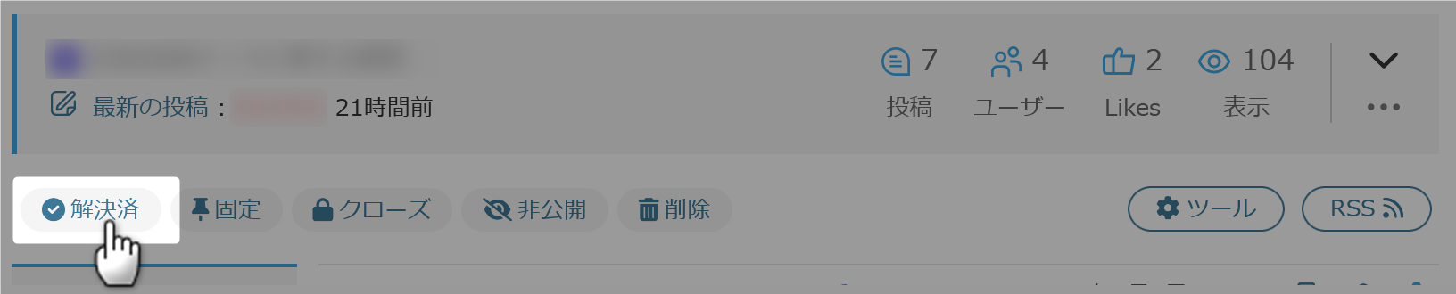
問題の解決に至った場合には、トピック冒頭の「解決済み」をクリックしていただけますと幸いです。
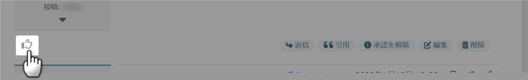
また、有用な回答があった場合は返信右下にある「いいね!」もご活用ください。回答者の励みになります。
(CC BY-ND 2.1)準じていれば(リンクを貼っていただければ)転載も自由です。カスタマイズ記事を書く際にコード等をコピペ利用していただいて構いません。
フォーラムの使い方がよくわからない場合は、テストトピックで自由にテストしていただいて構いません。
最近の書き込みはこちら。
詳細なカスタマイズ依頼をするならこちら。